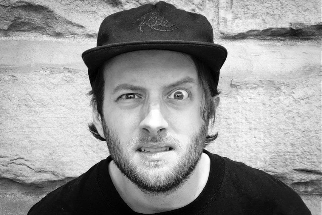
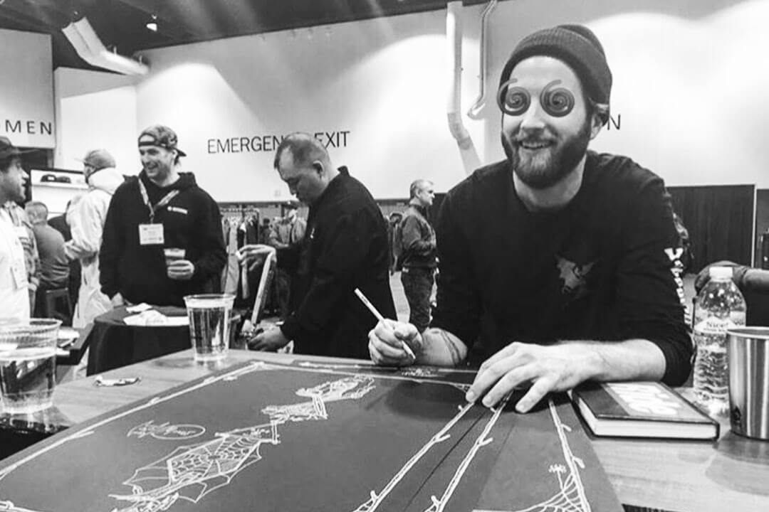
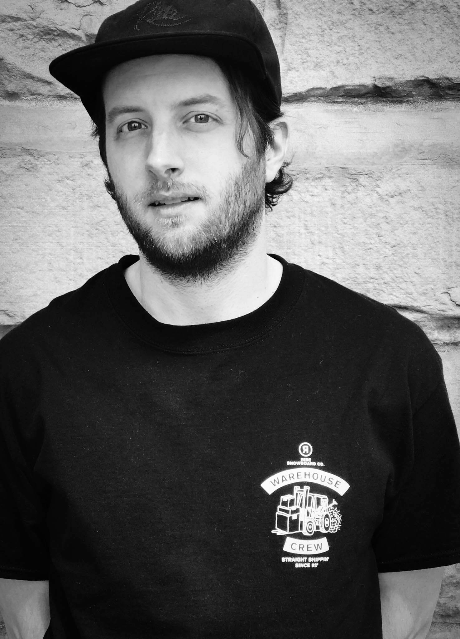
Have you ever wondered about the story behind your favorite board’s graphics? Do you spend your days in class or at work doodling and sketching ideas for decks? Dave Banks, or Venom Thunder as he is known in the design world, has been a silent but deadly presence within snowboarding’s graphic scene since the early 2000’s—and he is only getting started.
Friends will describe the Seattle based illustrator as “a child of the 80’s who went through puberty during the grunge era of the 90’s, prefers music and women of the gothic to metal persuasion, loves knee-slapper jokes, and can do a troubling impersonation of Linda Belcher from the show Bob’s Burgers.” (We can assure you that the Linda Belcher impression is impeccable.) Dave’s tenured career has included positions at Burton, Airblaster, Old Navy, Nike, Salomon, and most recently RIDE Snowboards—just to name a few. I gave Dave a call last week to get the down low on everything from his favorite pranks, his cat Bandit’s AIDS, and what it’s like designing snowboard graphics for a living. He did not disappoint.
Follow Dave on Instagram
Check out Venom Thunder
Are you ready to dive right into this sucker?
Yeah, sure, sure, man.
Awesome, so Venom Thunder, where did the name come from?
That’s a good one. It goes a while back. It kind of came from the question, “If I ever had a band name, what would it be?” I have always had a really good connection to music and movies, and I’m always sketching and doodling. Venom Thunder came out of that. It is the ultimate band name—but also a design studio.
It sounds like the ultimate 80’s hair metal band.
Yeah, totally… with some laser cannons thrown in there.
How long have you been operating under that pseudonym?
I want to say since Burton, before I was about to leave. In 2004 I started that website.
Have you Googled yourself at all recently?
No, I haven’t. Maybe a year ago because I was interviewing for this job, and you know all the ways people find you…
I dove in the other day; the first thing that comes up is www.davidnbanks.com.
Oh, no way.
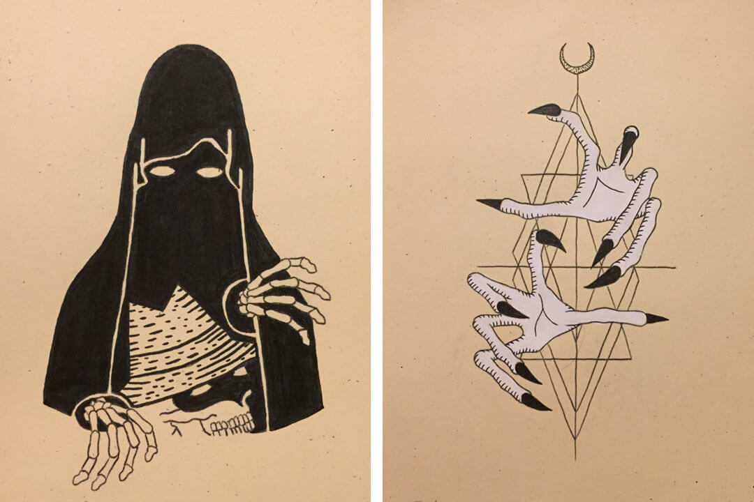
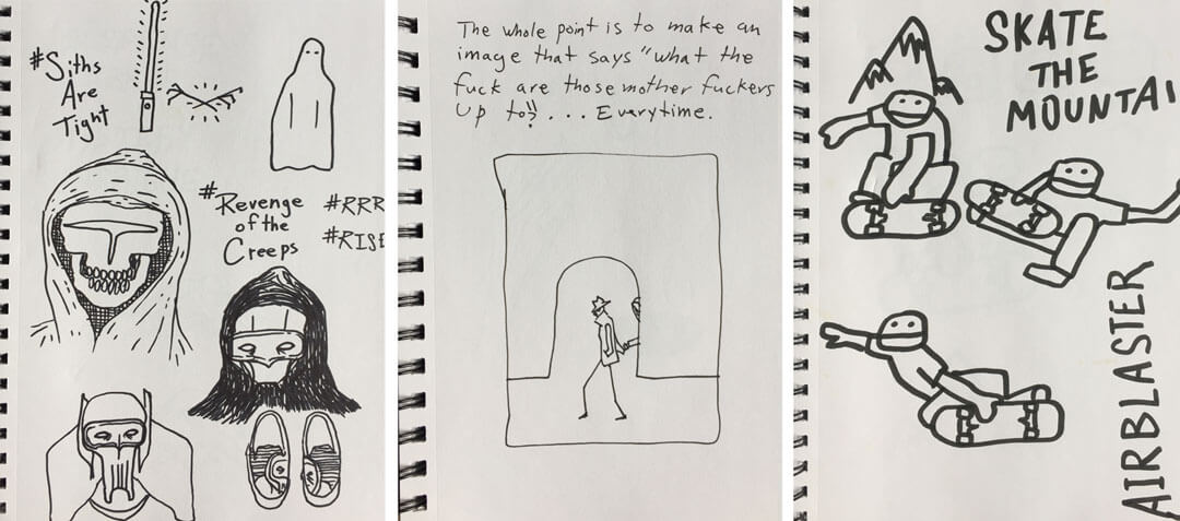
“I was always super into the bad guys in the cartoons, the villains and all of that shit.”
Yeah if you’re not familiar, it is quite the trip. David Banks Media, also definitely not you.
[laughs] I will have to check that out.
I got a good kick out of that while looking around for Venom Thunder. Anyways, you have worked for a hell-of-a-lot of brands.
Yeah.
Where did you start? Where was lift-of?
After art school I had the fortunate opportunity to work at JDK [design studio] (editors note: JDK is now Solidarity of Unbridled Labour) in Burlington, Vermont. They were–and still are—primarily known for working with Burton for a long time developing their board graphics. I remember going to the US Open back in ‘97, and going to a Burton tent and asking them who made their graphics, and how one would get involved. They pointed to JDK as the partnership they had for a lot of it. So from there, I really had a life goal to pursue that. I met a lot of really talented people through there.
Looking through your portfolio, the things you did with Old Navy are largely different than the things you have done with Salomon and are currently working on with RIDE. How much of that is a personal evolution, and how much of that is direction from an art director?
“Graphics right now are super fucking boring. I see a whole bunch of companies just not really taking any risks,”
Quite different actually. Old Navy was a crazy experience, probably one of the biggest organizations that I have ever been involved in. Just cranking out girls tee graphics for just about two months. It was a pretty clockwork scenario, you have an art director that basically gives you very strict directions, and while I was there I could crank out five-to-ten graphics a day—just put ‘em out there. Because they have a whole chain of command they need to go through to get approval. It was a good experience working for a company that is that big, and has that much volume—especially in women’s apparel.
Transitioning into snowboarding after doing that for a while was way different though. Because [in snowboarding] you get the ultimate direction— the kind I thrive on—where an art director is like, “you can do whatever you want” and I am like, ok sweet, I can focus on horror movies or metal music scenes—shit that I am into—and pitch stuff that I hold close to my heart and that I find super cool.
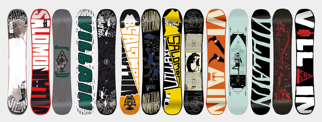
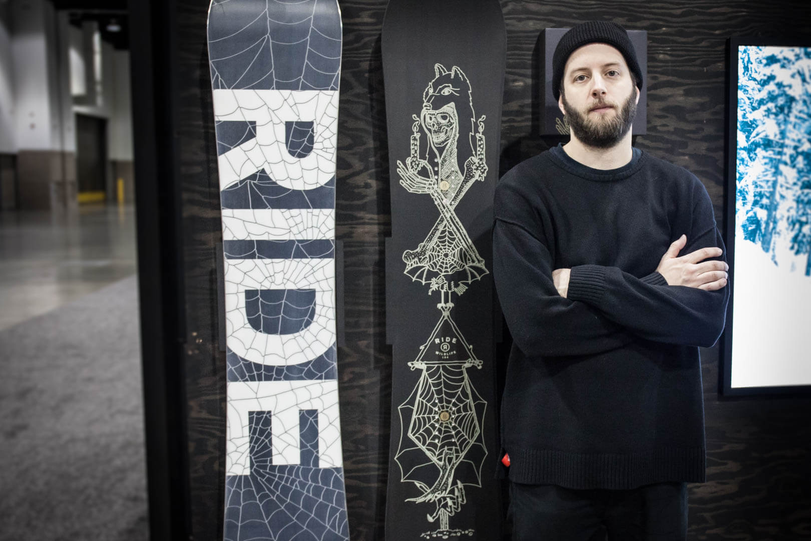
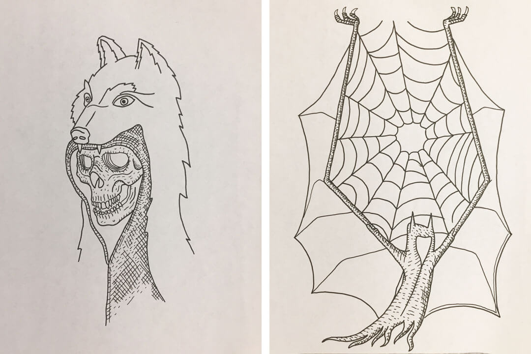
So would you say that your recent work, as far as the Beast logos with Airblaster, the Villain with Salomon, and now everything with RIDE, most closely resembles your personal style?
Yeah, for sure. Luckily at this point in my career people come to me for what I am into. It’s rad having more of those times where I am able to do whatever I want, and people are into it.
So if you were to do one thing with your art now, outside of any board companies or brands, would you continue to pursue this villain-esque character, the “creeps are tight” scenario?
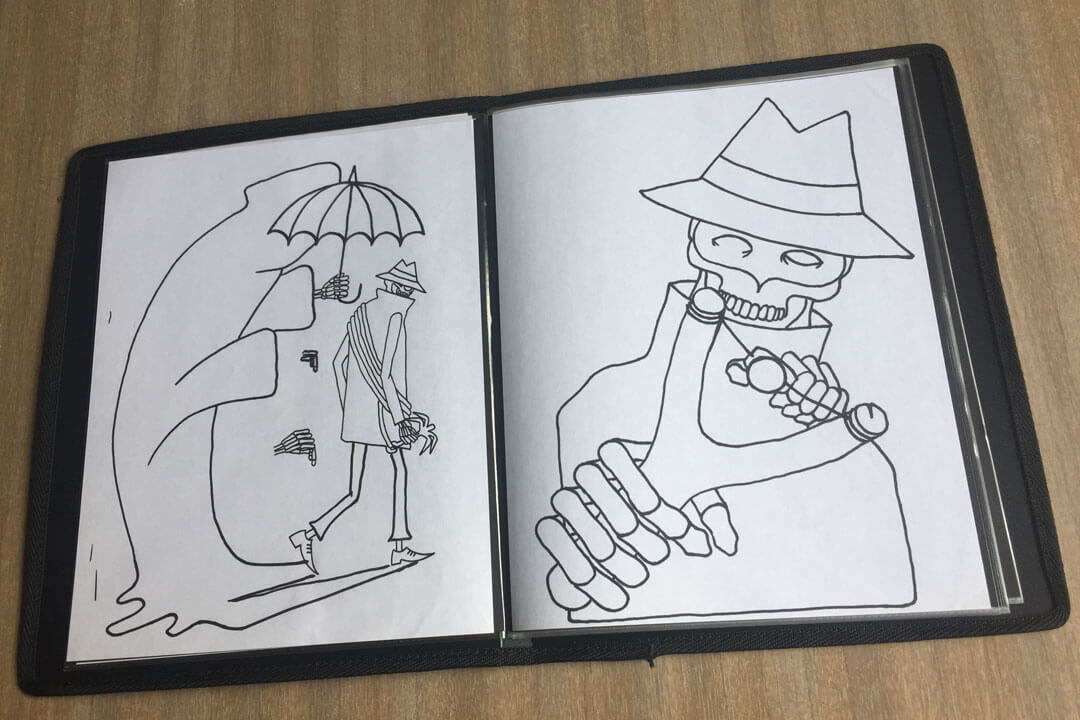
It has always gone back to cartoons and music. I was always super into the bad guys in the cartoons, the villains and all of that shit. Once I got that board project—that kind of just catapulted all of these fucking ideas that I grew up around. It is just kind of a darker, bad-guy theme that I have been able to roll with for a long time, and have seen all of these ways. There is a lot more potential than just doing boards to keep that going.
What does that have to do with your decision to use color vs. sticking to black and white?
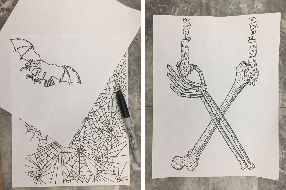
You know, I don’t know. It’s goes back to Macabre art. That genre is a constant inspiration. Late 19th Century art, is simple and not muddied up with color, it’s strict and truthful down to the line art. A lot of those disturbing depictions of horror from that time period are executed beautifully.
There is something beautiful about the simplicity of that, and not putting pop colors into it too often.
Would you say that you have a difficult time with color, or that it is more of a challenge? Or do you just prefer the aesthetic of black and white?
I definitely have done a lot of color work, and I have nothing against it, but I think the simplicity of black and white is a nice restriction to have. I think that is important, limiting yourself and staying true, letting the content speak for itself.
Do you have a dreams or plans to escape the board world?
For right now I fucking love it, it is just so gratifying. Yeah, that is a hard one to answer, I definitely think about it a lot. Music would be cool, movies, and movie posters—single image things like that would be fun to get into. But for right now, I’m feeling the vibe.
“I want to make a masterpiece, and I want someone to be fucking stoked to put his or her feet on the thing.”
Do you think there is a general trend in snowboarding that is either a good or bad thing?
Graphics right now are super fucking boring. I see a whole bunch of companies just not really taking any risks, it is all kind of mass market driven, so there is less content in the graphics, there is less reason for a purchaser to turn one way or another. I would love to see that change, to see a little more forward thinking shit out there, but right now it is kind of boring.
How important do you think graphics are to the average board buyer?
For me it has always been about the graphics, buying Powell Peralta skateboards, or Black Label, or whatever the brand might be, you kind of get attached to that look and that feel. Nowadays it is so different because the shape game is such a topic, everybody is making all of these new shapes, and there are so many different customers, and so many different angles you can spin it, that yeah, that’s a tough one. You definitely need to break tiers down to who your customer is, and who needs what, but man, I really hope people are buying for the graphics.
I definitely have always been one to appreciate graphics, and I have saved every board I have ever owned because of that. However, like you mentioned, purchasing patterns in the last few years have definitely taken a turn to include a focus on the shape and build of a board as well.
Right, yeah I mean I definitely hope people are collecting the graphics. That is kind of how I approach it. I want to make a masterpiece, and I want someone to be fucking stoked to put his or her feet on the thing.
Do you have a favorite graphic that you have worked on?
Oh shit, that’s a good one. Yeah. The second to last year I did the Villain, the one with the two feet on the base, that is probably one of my proudest moments, for sure.
How come?
Everything just kind of came together. Color and type, the type on the base was kind of an accident, and that season when it came out I just started seeing it everywhere – which is kind of a trip. It’s surreal. You start seeing it in videos and magazines and you’re like, “holy shit, people like this.” Seeing Louif [Paradis] on that graphic that season was a huge compliment, and a huge reason for the success of that board model.
What is the turn around usually like, year-to-year for board graphics? How long until from when you finish a graphic until you start to see it on boards?
We are in the thick of it right now. Usually like two years out they hit stores, it’s crazy.
Have you ever seen a graphic come out two years later and absolutely hated it?
Not so much hated it, but I have been so used to it that you kind of have to remind yourself that the rest of the world is just seeing it for the first time. It’s definitely a mind trip because the timing is so far apart.
Has there been a board in particular – perhaps that Villain– that has been more challenging than others to work on?
The challenges are always working with pros. Doing Bode’s board was always fun, but it was also—I don’t want to say a challenge, but it’s important to get what he wanted out of it, because I am a strong advocate for pro models looking like a concept a pro came up with. It should reflect that person and their personality. So we would have to go back and forth with different versions of the same idea, and the brand needs to chime in, so it is always kind of designed by a committee in those type of situations, because so many people need to sign off on it. A lot of the times you are directing and you want to make sure that the athlete is really stoked on what they are going to be shredding on.
“They were like, it could be three things, it could be feline AIDS, which is hereditary—which I had no idea was even a thing—cancer, or leukemia,”
Do you have any good stories from working with Bode or another rider on their graphics?
Jed and his Salomonder. It was probably the first season I had to work with him, and we went up to Govy, the team was at the house for a session or something like that. We were spitballing ideas, and it turns out there are actual salamanders in Frog Lake. So Jed’s all hyped and he’s like “Dude, we should collect a bunch of salamanders, and we’ll cut them up and photograph them, and it will be like guts everywhere and it will be super gory and super sick” So we went up there and swam around and collected a bunch of the salamanders – and they are super cool looking, like their hands are moving and their eyes are blinking. And I am talking to Jed so I ask him, “Are you ready to cut these things open?” And he was just like, “Dude, I can’t do it. These things are too cool, there is no way I can cut one of these up.”
Geez, you might end up with PETA breathing down your neck after a board graphic like that.
Yeah, honestly, you know, good idea at the time, but the execution was just a little bit much.
Speaking of animals, Tanner McCarty mentioned that your cat might have AIDS.
[laughs], Yeah, so this is totally weird. But yeah, he’s struggling with his health and I am a pretty loose cat owner. I have had him for 12 years this summer, and about a month ago he wasn’t doing so well so I took him to the vet and they did a blood test and called me back and they said ok, we were able to eliminate a few things, he’s got a low red blood cell count, but beyond that they can’t really determine anything. They were like, it could be three things, it could be feline AIDS, which is hereditary—which I had no idea was even a thing—cancer, or leukemia, so I was like, “holy – what?!” Those are all super fatal. But cats get old I guess.
I’m sorry to hear that, what is your cat’s name?
Bandit.
Have you always been a cat person?
Yeah, I guess so. Definitely had cats growing up. They are pretty easy to deal with.
My father never allowed cats in the house – dogs or nothing growing up.
Yeah it’s a weird thing. Parents aren’t usually into it.
Do you have any other favorite stories or experiences with graphics you have worked on?
I don’t know.
How about the biggest disaster, or roadblock?
The biggest challenge is just having everyone involved sign off on it. In my experience it is never yours from start to finish. It is such an expensive product that a lot of people are involved. It is always challenging to cover all of your bases and make sure people are stoked on it.
Was that a difficult realization to come to when you first started out?
Yes and no. The bottom line is that it really is commercial art. And with the amount of people involved in it, you can’t get too attached to it. That’s why I have my creative side projects, because there are a lot of compromises in board graphics. So if you can fulfill some of those creative goals on your own, that helps so much. I will always have that. No one can take that away from me.
What are some of the current side projects that you are working on?
There are always logos, and small things here and there. I am trying to work on a drawing series, to slowly collect a series that after I have completed them I can then bring to galleries, bars, or coffee shops. Have some little shows here and there.
Have you done many art shows or galleries in the past?
Not really. Maybe like one every two years?
“You definitely need to have a backbone, that’s huge, if you’re not into it, and it’s going to be produced on the mass level, than that is going to hurt.”
What are some of the challenges/ benefits to those? Is there a reason they are infrequent?
It just hasn’t happened. It is always a big production, whether you think it will be mellow or not. So I have done enough that I know what I am signing up for, ultimately I think they are just great social event, and a great way to share ideas. But with the full-time gig and keeping the commercial stuff going, it’s a tough balance.
Is there a place in particular that you have always dreamed about having a show?
Yes, somewhere in Tokyo I am going to have an art show. That has been a lifelong goal and I am definitely going to shoot for that.
Have you been to Tokyo?
Yeah I went this past summer for the first time. I did my first factory visit with RIDE in China, and some engineers and myself went through Tokyo and actually hiked Mt. Fuji down south on the way back.
What was that like?
It was unbelievable. It is such a visually rich culture and all hyper saturated. Stimulating the whole time. Hard to describe, but that was the first visit.
What was it like getting back to Seattle from there?
Yeah a bit of a reverse culture shock. Japan and then back to the states is a… you feel a little schleppier back in the states. Everyone is so well put together in Japan, and it definitely kind of sits in the back of your head—I’ve got to tighten up my kit a little more, you know?
Do you think you made the most progress in your career by sticking to your guns and your style or listening to critiques and adapting to feedback?
I would say a bit of both. You definitely need to have a backbone, that’s huge, if you’re not into it, and it’s going to be produced on the mass level, than that is going to hurt. You want to push shit out there that you are stoked on.
Any last thoughts you want to leave off on? Any advice or wisdom you might instill on someone interested in pursuing a graphic design or illustrating career?
Yeah totally, just be yourself, develop your own style, and make yourself and your art more valuable than the guy next to you. And get a good internship, honestly they are just great ways to make connections, meet people, and get involved in the industry.
See also: The man that hates pants: An Aaron Draplin interview