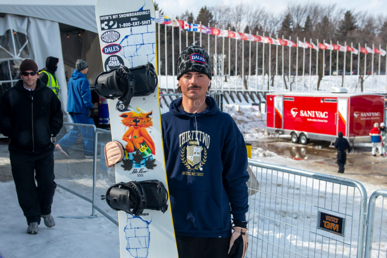
When the new 23/24 Rome board line dropped last month, we noticed a different look on some of the decks and wanted to know a bit more. A quick call to Portia Wassick, the team’s newest designer (who also was born and raised in southern Vermont), and the design process of concept to riding was quickly broken down. We edited up our conversation with the 28-year-old responsible for some of the new looks (alongside longtime creative director Michael Paddock and the team) about how she got from riding around Bromley to designing board graphics for one of the most storied brands in the culture, and what all goes into it. Enjoy a quick look into Portia’s world below! – Mark Clavin
What is your title with Rome?
I’m a graphic designer. I think if you want to get technical, it’s product graphic designer.
Do you work on all of Rome’s products then?
Yeah. It is split up so that I’m always working on next year’s product with Paddock, and our other graphic designer is always working on the current year.
How long have you been with the crew?
About a year-and-a-half now.
Did you go to school for design?
Yes, I went to Western Colorado University for graphic design and printmaking.

Was this always the plan?
I think so! I went to Western for more than the normal four-year limit–right around six. Moved back to Vermont right when COVID hit after I graduated. It was a childhood dream of mine to work on snowboard products. My parents actually worked for Burton in the 90s on softgoods design.
Woah, first generation snowboard tech design.
They worked at Burton from 91 to 93 so they did a lot of softgoods design and work for the US Open. I went to Homesick this past year and actually saw so many people wearing the jackets my parents designed. It was pretty surreal.
It’s in your blood.
Yeah. So I moved back to Burlington. I was pursuing graphic design as a career and the job for Rome popped up. Friends sent it to me and I thought, What do I have to lose by applying. And I got the job.
Was it a red job listing on Instagram?
Yep! It was on Instagram and there were three different jobs that were listed, graphic design positions and an industrial designer position.
I only remember that because not many snowboard companies honestly post their jobs on Instagram. I don’t see why not…it obviously worked out!
It was pretty wild. I’ve never really seen any other companies do something like that either. I think Rome just wanted to get it out there. I didn’t even see the listing initially. Ten different people sent me the story. I grew up in Vermont, obviously, so Rome has been a pretty prominent part of snowboard culture since my childhood. It has been really cool to come onto the crew.
Were you riding a Rome board when you applied to work there?
I had a Rome board, yeah. Had a couple of boards in the quiver, haha.

So your first project was working on this line?
The first thing I did at Rome was work on 23/24 graphics, which was a pretty wild thing to dive headfirst into. Within a few days of starting, I was working on board graphics. Paddock just gave me the rundown on how things work and said, “Have at it. See what you come up with.” I was coming in at the middle of production design for the whole line but was fortunate enough to be able to design a few, which was really cool as a new employee.
Did you work at any other jobs first or was this like the lucky story straight out of college?
So I did freelance for a while and then I worked for The Skinny Pancake in Burlington as their in-house designer for a year before working at Rome.
What programs do you use to design product?
For boards, it is primarily Illustrator or Procreate on an iPad to do a lot of the illustrative work. Same thing with bindings, boots, and softgoods. It’s pretty fun. I’m not gonna lie, I knocked the iPad for a little while, kept drawing on paper…and then I actually started using one.

And what all did you have a hand in?
I am looking at the line right now. The ones that I kind of led design on were the Women’s Ravine, the Freaker, the Muse, and the Hype, and Paddock and I worked together on the Heist and Stale’s boards. Those were influenced a lot more by Stale, because those are his pro models and he kind of wanted to match his Oakley kit. So he really wanted to go one green and one orange with neutral tonal hits that match a lot of his pro model stuff for the last few years. Dialing in the orange on the Stalefish was actually pretty difficult. I think we landed on a really good, nice, more burnt orange.
For sure, that is one of my favorites.
A lot more thought goes into the exact color than one might think. Sometimes we’ll go through a couple rounds of topsheet samples before we land on the one that we think looks really good.
What is the process like?
It’s tricky to say. We’ll usually do a few sketches of the boards on the computer, present those to the small general audience of just the in-house Rome creative team and go from there. So it could be as easy as “Oh, that sketch is really awesome, just needs to be cleaned up…” and it’s good. Or maybe a four- or five-hour endeavor of critiques and different feedback into consideration. At that point, it could take days, if not maybe a few weeks, to really dial one in correctly.
The Muse took me, I’d say, probably 15 or 16 hours of consecutive work to get to the exact design that it is now. It’s a very popular board, so it’s got a little more pressure behind it.
Is it more nerve-wracking working on the topsheet or the base?
I would say topsheet because the base normally has a general direction that those always go, you know, like a big, large branding–very legible. Topsheet’s a little bit more nerve-wracking. We also have to consider how they fit into the line next to each board. For instance, with the Heist and the Hype, it’s basically the same shape with different features and kind of a different personality to some extent. So you wanna make them look really different so that you can differentiate between the two.
What is the difference between the Heist and Hype?
The Heist has a lot more higher-end materials in it. It has bamboo Omega Hot Rods, a different base, and different quality topsheet. It looks a little bit more high end when you see it on the shelves. There’s a $100 price difference between the two.
The overall line is a little quieter than years past coming from Rome. Is that a conscious evolution of what you all are doing?
It’s a pretty conscious evolution of what we’re doing internally and the direction that the general snowboard market is moving into. There were a lot of years where every board graphic was super loud and colorful, and Rome was kind of at the forefront of a lot of those graphics. In the 2010s, Rome was one of the loudest and most prominent brands doing that. I think now you’re seeing more simple top sheets in the market, some louder bases, so in a lot of ways we wanted to move toward that more muted aesthetic. Make it interesting while also being a little less loud.
You have to take into consideration who your general target market is for the board. The Artifact is going to be very different than the Ravine Select. With that general customer in mind, that definitely influences how loud the graphic is and what the attitude is. We get really into researching what we want to do, color-wise, and then design-wise, it’s very involved. With the Stalefish and the Crewzer, I think I drew like probably upwards of 25 trees to get the right one.
And that is your tree right on the front, dead center?
Yes. We worked with Stale really closely to get this idea of the Norwegian Tree of Life. He picked the runes out. We’ve got the Ouroboros in there, which a fun callback to the Degenerati for those who know about it. Paddock and I both have sketchbooks filled with ideas, and you might pull one tiny little thing and evolve that five more times.
This is the first production cycle that you put your work into, now people are strapping in on them. How does that feel?
They released a couple of weeks ago, so now they’re actually out in the world, which is pretty wild to see. I never thought I would actually be riding a snowboard that I designed–a real one, not just something I painted. It’s awesome, but it’s even wilder to see other people riding them, especially our team riders. I think that was crazier for me, seeing Ivika and Madison Blackley ride a board that I designed.
There are fewer art designers in snowboarding than pros. You are pretty influential on what snowboarding can look like, on the whole.
Never thought of it like that. It can be a little nerve-wracking sometimes, but we work really hard on the Rome creative team to do a lot of research, take inspiration trips, and really try to figure out what we like and what people are going to want.
With a Vermont-based company, where do you go for the inspiration trips? New Hampshire?
I got to go to New York City for a week last December. I spent a lot of time in museums. I walked around Soho for an entire day, seeing just kind of what was going on in stores there and even just seeing what people are wearing on the street. Maybe you find a really prominent color for the upcoming trend cycle.
What does it mean to have Paddock as your creative director over there?
I mean, he’s been doing this for a very long time. It’s huge to have a mentor who has been in the game for so long and has created so many really prominent snowboard graphics that I grew up seeing. We really try to collaborate on everything.
And finally, already working on 25/26 graphics?
So the cycle of how this works is pretty far out at this point with production deadlines. We finished 24/25 boards in June. Bindings and boots actually come before boards with how manufacturing works, and bindings are a lot more complicated. So we design bindings first and then boots take a little bit less designing. It’s mostly just picking the colors. And then boards come last. Right now I’m working on the packaging, the more minor product details, and then we are about to start in on 25/26.

